

In this activity, I explored the different aspects and qualities of a few different font types. The 7 fonts types I explored were:
- fette fraktur lt standard regular
- stempel garamond lt std roman
- bauer bodoni std 1 roman
- rockwell std regular
- futura std medium
- helvetica lt std roman
I listed a couple physical traits of the fonts, along with personality traits and a fitting job I thought suited the font. It was a little difficult coming up their personality because they are just letters, so I took an adjective and its polar opposite and asked whether the font was this or that and I managed. Next I enlarged letters I thought were interesting and blew them up to only close in on specific parts of the letters.
Once I completed my exploration of all the fonts, I then took at least one cell from each font and tried creating an abstract poster that conveys hierarchy. It was really fun trying to piece together each one, seeing which part fit or flowed into each other well, it was kinda like a puzzle.
Overall, it was very interesting to explore and work with specific parts of font only and not use them as a whole. I definitely learned some things from this activity. Here's a link to my dropmark where all the stuff I used is.
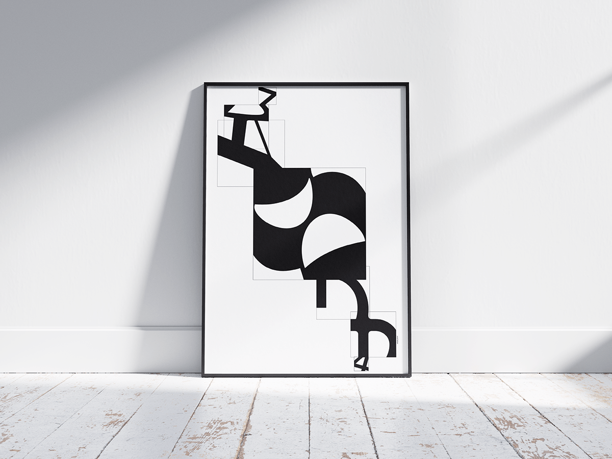
This was my favorite! I really liked the asymmetrical but balanced look of it and how they kinda all flow into each other. I was also told that the middle cell felt sad, like how the white crescent shapes looked like sad eyes. I see what they meant and I really like how it turned out, kinda reminds me of the stereotypical drama mask where one side is sad and the other is happy. ^ w ^


A little bit of the creative process U w U

It was also really cool exploring how the poster would look outside. It's really cool seeing things you make come to life > w <


